Planning and Design Group (PADGRO) Consultants Pvt Limited are a 40+ yrs old, multi-disciplinary Architecture firm. They wanted to revamp their website.
Analysis & Stakeholder Interviews
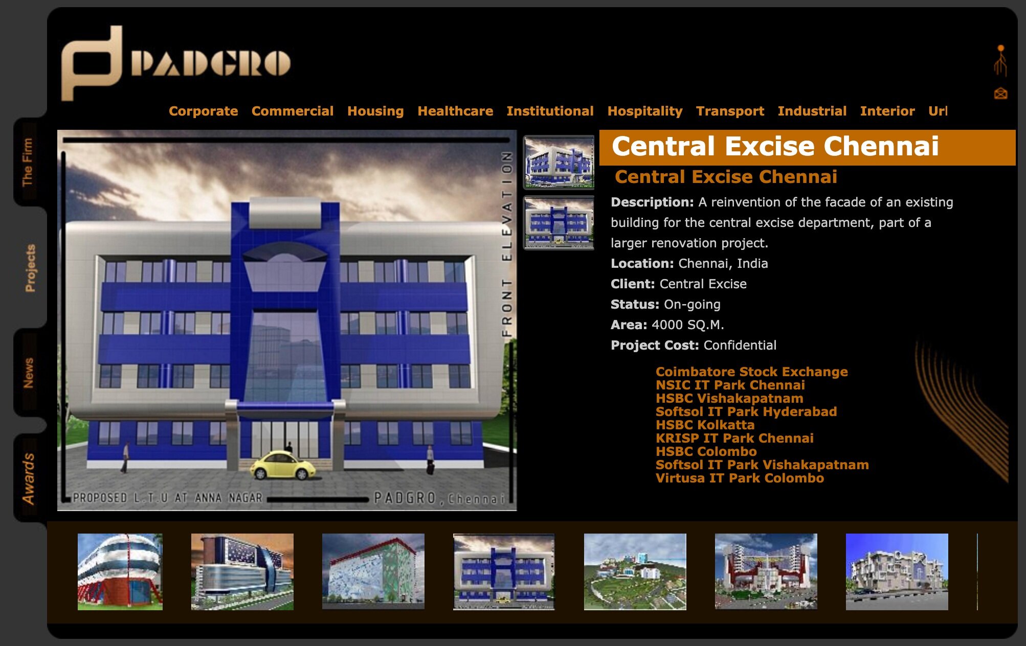
The current website gave an idea of their vast portfolio. But it was also necessary to understand ‘how’ Padgro works - their approach, strengths, client interactions. Therefore, I conducted Stakeholder Interviews - gathering their expectations and hence the website redesign requirements.
Why do you think a client prefers your firm?
What is the kind of information required to convince clients of your capabilities?
Key Requirements
A one-stop multi-speciality firm with experience and expertise
They wanted to showcase their diverse portfolio spanning across more than four decades + catering to almost 13 sectors. At the same time they wanted to swiftly access specific projects especially when in client meetings. While they offer comprehensive services they wanted the niche offerings to stand out. Their accolades and recent projects are updated more on social media but they would like their website also to reflect the same seamlessly. Although most viewership would be on desktop/laptop, a mobile-friendly website was required.
“How do we communicate QUALITY?” - their question for me!
Sitemap
Worked with client to understand the extent of content at hand, the availability of assets and their formats. Based on that, grouped them under relevant ‘SECTIONS’ for the site that were mutually agreed upon.
Wireframes
Study of Architecture Firm Websites around the world - a brief exercise carried out to -
A) Learn about the ways in which they organise their information, priorities, menu kinds and labels mostly used and especially responsive UI design
B) Handpick certain sites either for their layout style or other user interaction models as reference for clients to articulate how they wanted their own site to be
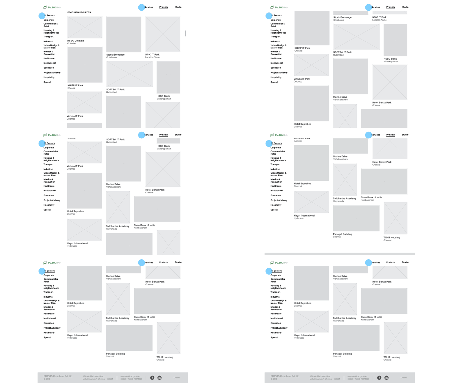
Categorised Project thumbnails was the most common approach amongst firms for visually navigating their portfolios.
But PADGRO was looking for an additional, simple yet interesting way of depicting their spectrum of projects and hence expertise. Also they preferred that the site be intriguing without being bound by symmetrical grids/layout.
Navigation
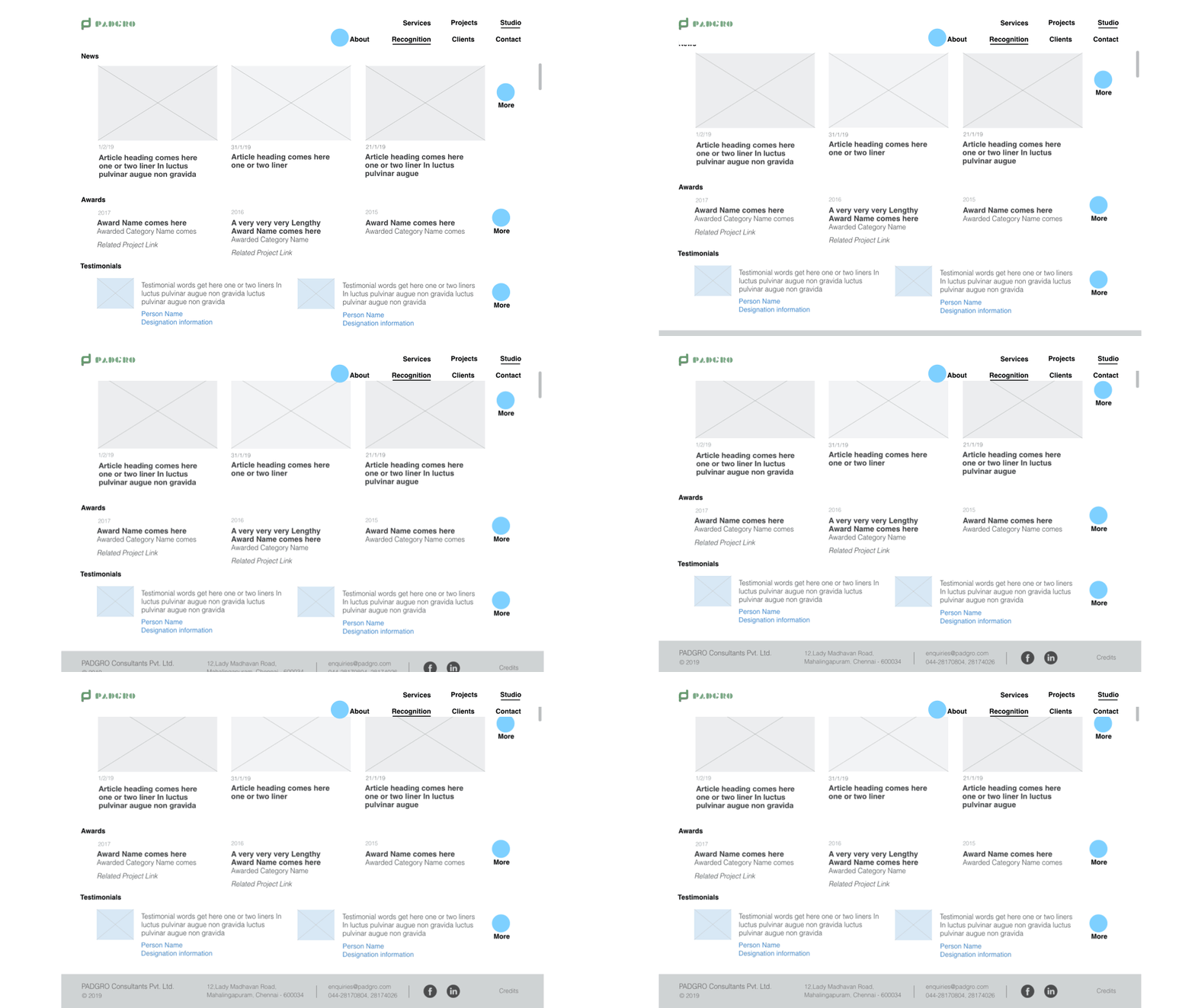
The Sitemap helped in charting a minimal horizontal main menu plus a vertical sub-menu for deep-diving. Suitable breadcrumbs and stationary header with main menu allow easy exploration of the site. A summary view was ensured for main landing pages to ensure the visitor always had an idea of the depth they could traverse.
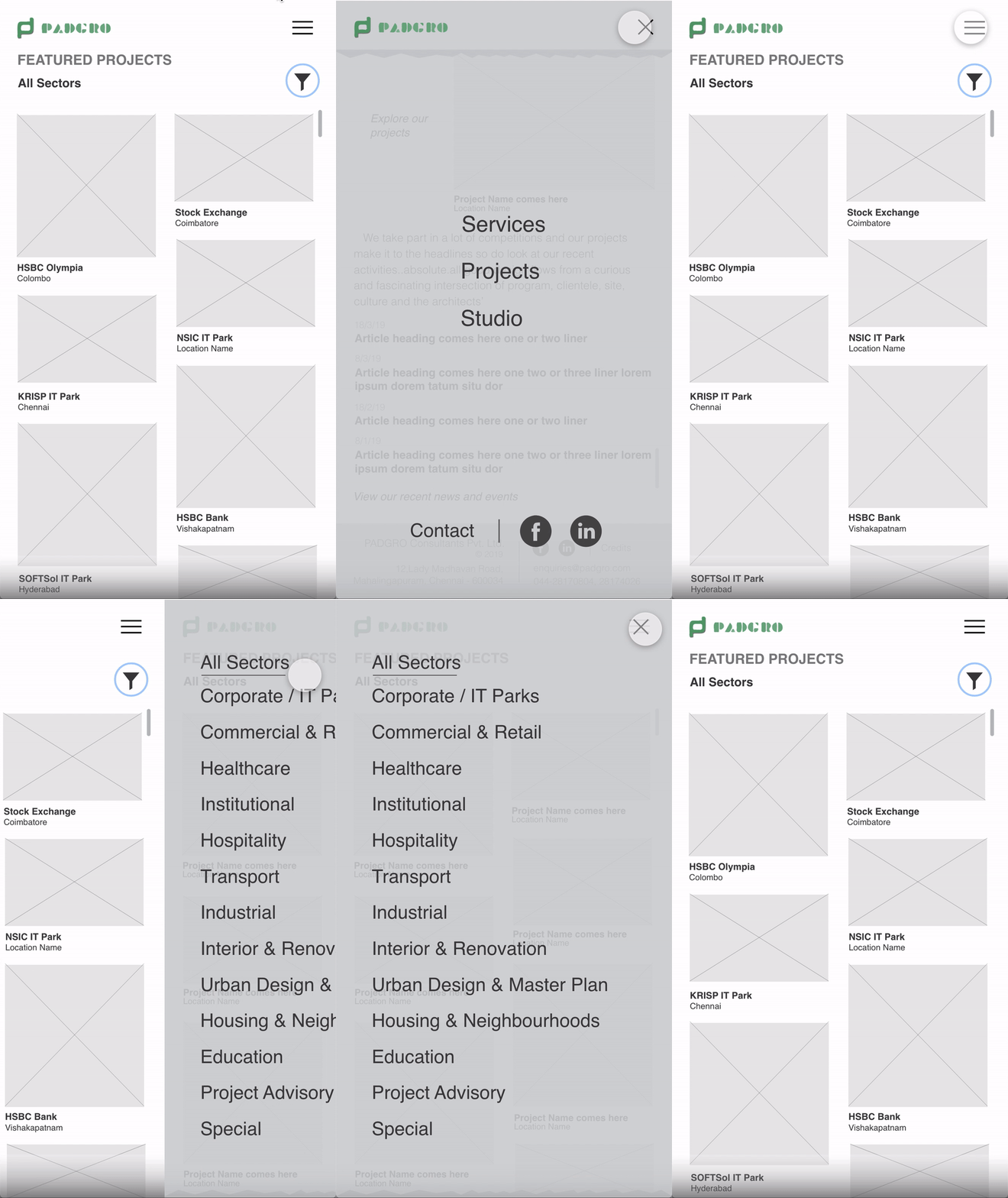
For the Mobile version - main menu was mapped to hamburger icon and vertical sub-menu to filter icon.
Home Page
Use of Infographics
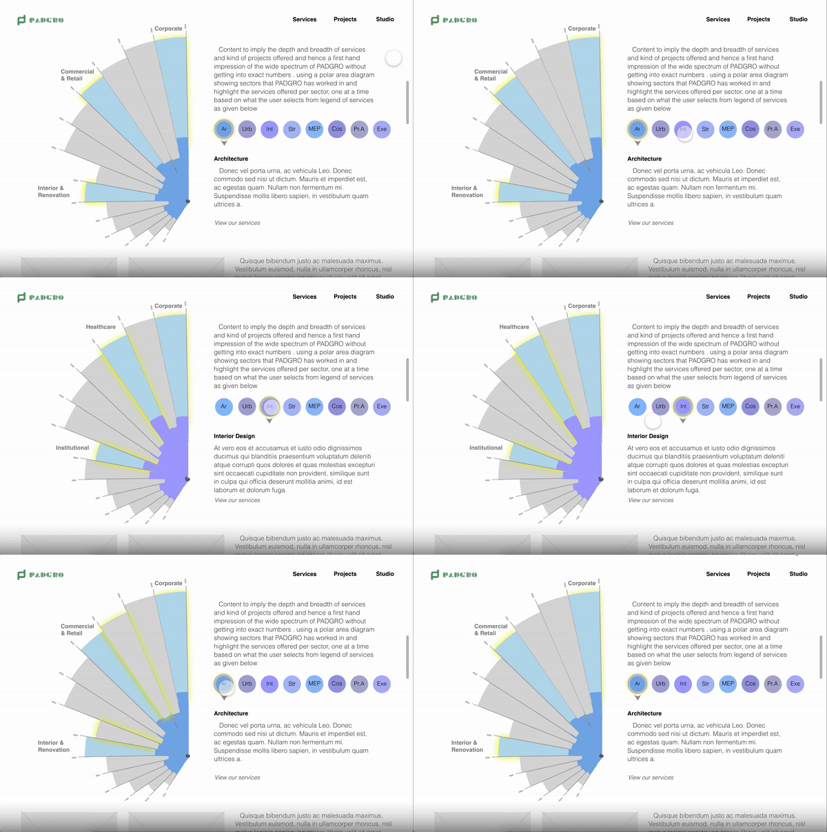
To subtly showcase client portfolio variety and depth without getting into overwhelming numbers about project count, budgets or timelines. This was also an element that might pique the interest of a visitor, by being non-conformant to the typical layouts mostly followed by competitors.
Polar Area Chart was chosen to represent Firm Portfolio Summary. The sectors of the chart were equated to Industrial sectors such as - Corporate, HealthCare etc. with the area representing respective projects executed. An overlay of chosen Service type - Architecture, Urban Planning etc would appear to highlight the sectors using the service most + the extent of the Service across Industrial Sectors.
It was a conscious decision to have limited interaction, so it is ensured that there is an interesting yet concise overview.
Prototyping
Tools Used - Adobe Illustrator, Adobe XD, KeyNote
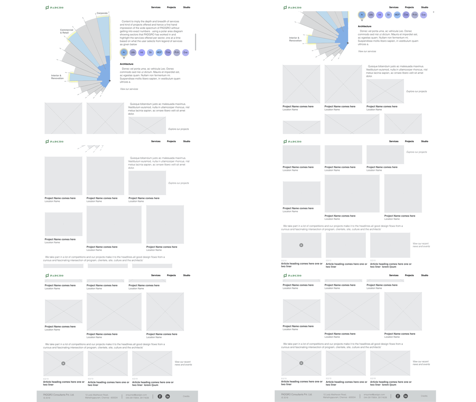
After many versions on paper and digital, here are few proposed screens.
FOR DESKTOP
FOR MOBILE
Scope
The deliverables were grayscale annotated and interactive wireframes. The client would like to take this up for development soon. In case of development with CMS like Drupal, these wireframes would still serve as reference to select a theme/template and further customise.
While a sample Polar Area chart has been used for reference, it would be interesting to plot the actual data and assign weightage to different attributes of the sectors - project count, budget, actual area of project etc. Thereby sector area would represent scale of projects and not just the count.
